Phone
Phone  Email
Email


- Trophies and sustainability
Why outdated award design hurts corporate branding
Trophies in corporate award programs can be a strong communication tool, but they damage branding when their design contradicts the identity the company defends everywhere else.
The inconsistency becomes public at the moment the brand is most exposed: the ceremony, the photo, the desk of the person who received it.
This article covers why the mismatch happens, which design patterns tend to produce it, and which material and format trends are moving the sector away from it.
Index
- Why traditional trophy design no longer fits corporate identity
- Aesthetics alone won't fix it — the real branding problem
- Common design mistakes that make trophies feel outdated
- Modern, sustainable trends shaping corporate recognition
- What a brand-aligned trophy requires
Why traditional trophy design no longer fits corporate identity
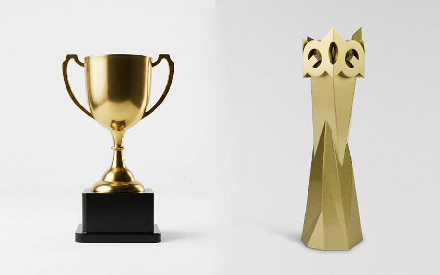
The traditional column-and-figure trophy was designed to signal athletic victory or school achievement, not executive recognition. Its visual code comes from sport: gold finishes, marble bases, human figures in movement. Handing that award to a director in a company with a clean or technology-driven identity creates a direct mismatch.
Most companies apply strict criteria to their website, their offices and their marketing materials, but buy the award as a generic off-the-shelf trophy without the same review. The sector itself is already moving away from that standard.
Aesthetics alone won't fix it — the real branding problem
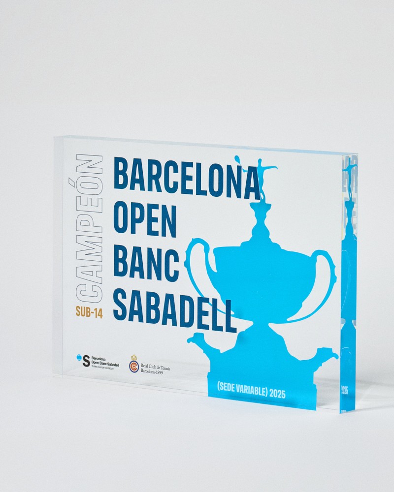
A more expensive award does not solve the problem if brand values do not guide the decision. Programs that treat recognition as a long-term investment commission custom trophies with defined dimensions, materials and finishes.
With award programs in corporate environments, a misaligned design damages perception even when the rest of the identity system is consistent. The criterion is not how expensive the award looks, but how accurately it represents the brand.
_1.jpg)
Common design mistakes that make trophies feel outdated
Most outdated award design comes from decisions made by default rather than by criteria. The award is treated as a purchase to close, not as a design problem to solve, and the same errors repeat:
- Excess ornamentation. Dense engraving, gold plating and baroque forms that add no information.
- Borrowed sporting codes. Cups, stars and figures taken from league and school contexts.
- Chromatic and typographic inconsistency. Colors and typefaces that do not match the identity of the organization granting the award.
- Generic shapes. Standard silhouettes with a plaque added and no real customization.
- No placement criteria. Format and size chosen without deciding whether the award will sit on a desk, a wall or a cabinet.
Modern, sustainable trends shaping corporate recognition
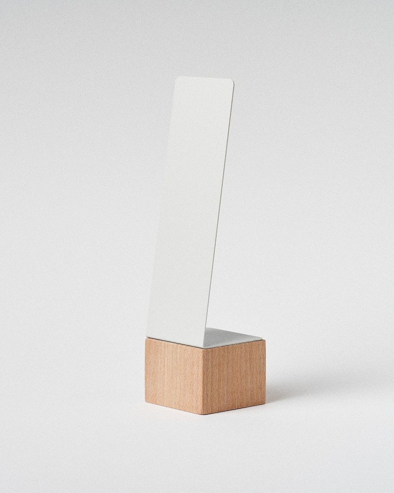
Minimalist design is the common denominator: fewer surfaces, no applied ornament, and the brand carried by geometry and material rather than by decoration. Recycled content and processes that allow real customization are displacing the metal standard:
- 3D trophies. Additive manufacturing builds the shape layer by layer, so geometry can be sculptural and customization is structural. Materials like recycled PLA and PETG keep environmental impact low without reducing durability or finish quality.
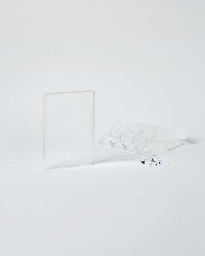
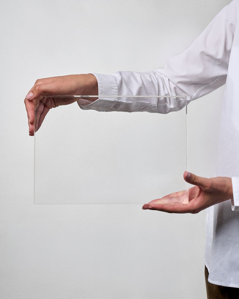
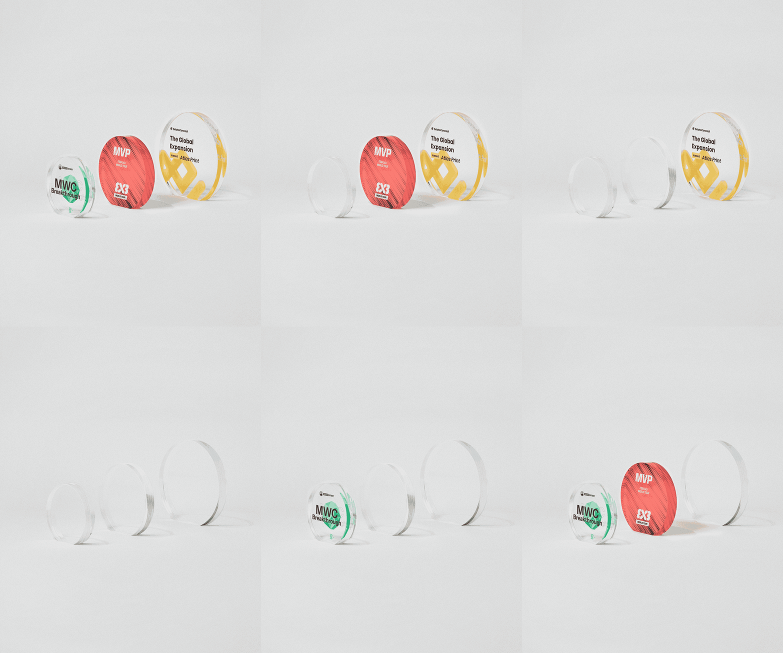
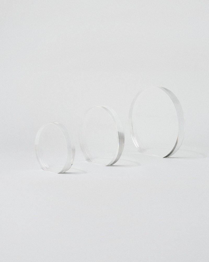
- Recycled acrylic trophies. They transmit transparency without adding structural weight and hold engraving with sharp edges.
- Post-consumer recycled plastic trophies. A dense recycled plastic with a stone-like appearance, obtained from urban plastic waste. It replaces the stone base of classic trophies and scales to high volumes.
- Recycled concrete trophies. An industrial, minimal finish with a physical weight distinct from the rest. It suits senior-level recognition.
.jpg)


Leave outdated award design behind
Align your trophy with your brand
Explore modern trophiesWhat a brand-aligned trophy requires
A brand-aligned trophy requires the same criteria applied to every other point of contact with the brand. Three variables define the choice: frequency of delivery, where the award will be displayed, and the values it should reinforce. In companies with environmental commitments, the material itself carries part of that message, aligning form and values in a single object.