- Trophies and sustainability
Acrylic Trophies: UV Print Preparation Guide
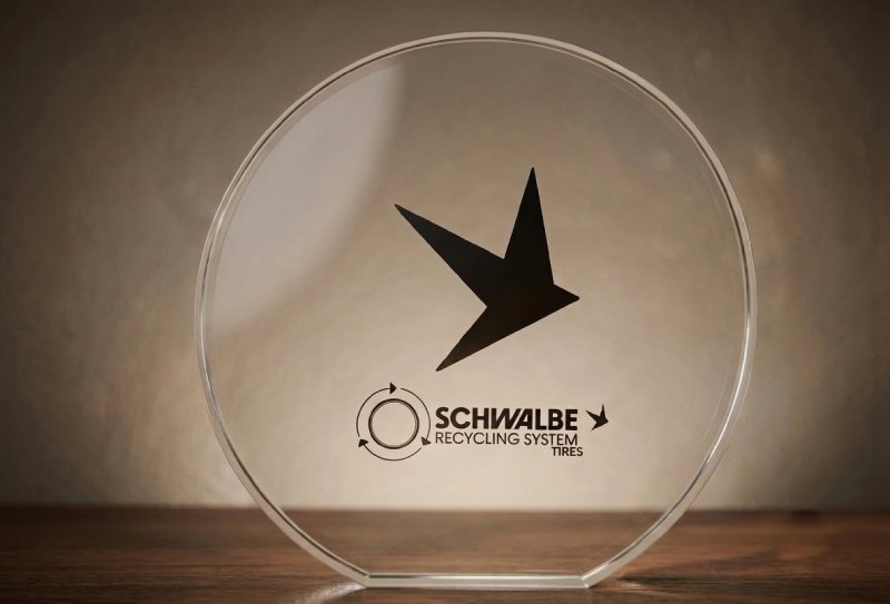
Acrylic has established itself as one of the most versatile and elegant materials for the manufacture of corporate trophies and personalised awards. At Sustain Awards we design and manufacture acrylic trophies with crystal-clear transparency, durability and professional print quality.
However, designing for acrylic requires specific technical knowledge that goes beyond traditional graphic design. UV printing on this material has particular characteristics that, if not taken into account, can compromise the final result of the project.
In this detailed guide, we share the technical knowledge required to prepare professional print files on acrylic, from the basic file structure to the advanced techniques for applying support white.
Fundamental file structure
The preparation of files for acrylic printing follows a very specific scheme that differs from the usual work on other substrates. Each trophy requires an independent file with a clearly differentiated three-page or artboard structure.
.jpg)
.jpg)
First page: the outline
The first artboard must contain only the outline or silhouette of the trophy. This page serves as a reference for the cut and must not include any design elements. The profile must be drawn with absolute precision, as any deviation will affect the final result of the piece.
Second page: front print
This is where all the design that will appear on the visible face of the trophy is placed. This print will be applied directly onto the front surface of the acrylic and will be the first layer the viewer sees. It is essential to work all elements in CMYK and ensure that texts and logos are fully vectorised or converted to outlines.
Third page: back print
The back face is printed in normal reading direction, without flipping or creating a mirror effect. This is a crucial point that often causes confusion: although the print is applied from behind, the production operator will carry out the necessary flipping. The designer must deliver the file as it reads, without reversals.
This tripartite structure is mandatory and allows no exceptions. Maintaining this order facilitates the production flow and eliminates errors in the printing phase.
The Roland support white: technical foundation
Printing on transparent acrylic presents a specific challenge: without an opaque base, CMYK colours appear translucent and lose intensity. This is where support white comes into play, a fundamental technical element that differentiates an amateur print from professional work.
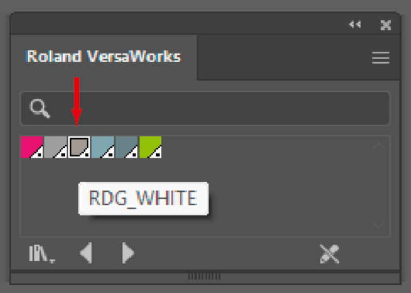
Installing the technical library
The first step is to install the Roland VersaWorks Technical Inks library in Adobe Illustrator. This is an .ai file that must be copied to the programme's preset path:
C:\Program Files\Adobe\Adobe Illustrator [version]\Presets\[language]\Swatches
Once installed, the library will be available in the swatches panel, providing access to the special colour «RDG_WHITE», which acts as an opaque ink specifically formulated for Roland printers.
Correct application of white
The correct technique requires creating two Roland white layers with the exact same outline as the CMYK print. Both layers must be positioned immediately below the colour print, maintaining perfect alignment.
The double white layer is not redundant: the first layer seals the surface of the acrylic and the second reinforces the opacity, ensuring that the upper CMYK colours are seen with full intensity and saturation, without the transparency of the material diluting them.
A common mistake is to slightly shift these white layers. Any misalignment, however minimal, will generate visible halos around the design or leave areas without adequate opacity. Precision at this step is absolutely critical.
When to use and when to omit support white
Not all designs on acrylic require support white. The decision depends on the visual effect sought.
Cases that require support white
Apply support white when you need a fully opaque and solid finish. This includes solid colour backgrounds, gradients that need to look dense and saturated, photographs that require chromatic fidelity, and especially coloured texts or graphics that need to stand out with maximum legibility.
White is also essential when the design includes texts or graphic elements in white that must be visible. In these cases, the Roland white does not act as a base but as a direct print colour.
Designs without support white
When the creative concept seeks to take advantage of the characteristic transparency of acrylic, the support white must be omitted. This approach is particularly effective in minimalist designs where the visual lightness of the material adds elegance and sophistication.
Trophies with a stained-glass effect, designs that play with translucent overlays, or pieces where the environment visible through the material forms part of the composition, are cases where dispensing with the support white enhances the aesthetic result.


Do you need trophies with international shipping?
Explore our collection
View our trophiesTechnical file preparation
Beyond the tripartite structure and the support white, there are additional technical requirements that guarantee trouble-free production.
Dimensions and scale
The artboards must be configured with the exact size of the final print. Do not modify the scale, position or silhouette of the base templates provided by the manufacturer. These templates are calibrated to compensate for production tolerances and any alteration may result in dimensional misalignments.
Colour mode and vectorisation
Work exclusively in CMYK. RGB mode will generate automatic conversions during the RIP that can alter colours unpredictably. All texts, logos and graphic elements must be vectorised or converted to outlines. This eliminates any dependency on typefaces and ensures the design is reproduced exactly as it was created.
Transparencies and effects
Flatten all transparencies before exporting. Blend modes such as Multiply or Overlay may be interpreted differently in the UV printing workflow, generating unexpected results. Check that no active effects remain that depend on Illustrator's rendering engine.
Resolution and alignment
Although you work primarily with vectors, any rasterised element must have a minimum resolution of 300 ppi at final size. Verify the pixel-perfect alignment of all elements, especially in the support white layers. A shift of half a millimetre may be imperceptible on screen but very visible on the physical piece.
Specific design considerations for acrylic
Acrylic as a substrate has characteristics that directly influence design decisions.
Edge and bleed management
The print can extend to the edge of the material, but this increases the risk of wear during handling and packaging. If the design requires full bleed, use light colours or soft gradients in the perimeter areas. Dark and saturated tones at the edges are more susceptible to showing scratches or ink drops.
Backgrounds and solid colour areas
Although technically possible, avoid large-area uniform dark backgrounds. UV printing on acrylic tends to show slight texture variations in areas of very dense solid colour. When the design requires dark backgrounds, consider subtle textures or fine halftone patterns that conceal these possible variations.
Typography and legibility
Do not use type sizes below 6 points. The UV printing process, although precise, is not optimised for extremely fine details. Bold or Semi-Bold weights offer better legibility than Light or Thin, especially for white typefaces on a transparent background.
Recommended workflow
To optimise the process from start to finish, follow this working order:
- Consult the base templates provided by the manufacturer and configure your file with the three required artboards.
- Develop the design on the second artboard (front face), working in CMYK and vectorising all text elements.
- Duplicate the design outline and apply the RDG_WHITE colour from the Roland library. Create two identical layers and position them exactly below your colour design.
- Prepare the back face on the third artboard, applying the same support white technique if the design requires it.
- Flatten transparencies, convert texts to outlines and check that no active effects or blend modes remain.
- Export to PDF without compression, with all elements on a single layer and without crop marks.
Common mistakes and how to avoid them
Flipping the back face: The most frequent mistake is delivering the third page flipped. Remember that it must be in normal reading direction; the flipping is carried out by production.
Insufficient white: Applying only a single white layer or using an incorrect white (CMYK 0/0/0/0 or RGB 255/255/255 instead of Roland's RDG_WHITE) results in a lack of opacity.
Layer misalignment: Failing to verify the perfect alignment between the CMYK design and the white layers generates visible halos on the final piece.
Layered files: Delivering PDFs with an active layer structure can cause problems in the print RIP. Always flatten everything onto a single layer before exporting.
Ignoring templates: Modifying the dimensions or proportions of the base templates for aesthetic reasons compromises the final fit of the piece.
Pre-print verification
Before sending the files to production, carry out this checklist:
- ✓ File with three artboards: outline, front, back
- ✓ All artboards with exact template dimensions
- ✓ CMYK colour mode throughout the document
- ✓ Texts and logos converted to outlines
- ✓ RDG_WHITE support white in two layers beneath the design
- ✓ Perfect alignment between the CMYK design and the white layers
- ✓ Transparencies flattened and no active blend modes
- ✓ Rasterised elements at a minimum of 300 ppi
- ✓ Back face in normal reading direction, not flipped
- ✓ PDF without compression, single layer, no crop marks
Do you need trophies with international shipping?
Explore our collection
View our trophiesConclusion
Printing on acrylic represents a specialised technique that combines traditional graphic design with specific technical knowledge of the production process. Mastering the file structure, the correct use of Roland support white and the technical preparation requirements makes the difference between an amateur result and a professionally crafted trophy.
Acrylic offers unique creative possibilities: from fully opaque pieces with intense and saturated colours to ethereal designs that take advantage of the material's transparency. The key is to understand the technique sufficiently for it to become a creative tool, not a limitation.
With the correct methodology and attention to technical detail, acrylic trophies become recognition pieces that combine aesthetic modernity with durability and professional execution quality.